Pingo Doce
Pingo Doce, Portugal’s oldest modern retail chain, reached its 45th anniversary facing increasing competitive pressure. With over 460 stores and a private label representing 40% of total sales, the brand needed to strengthen its emotional connection with consumers — especially within the Indulgence category, where decisions are driven more by impulse than rational planning.
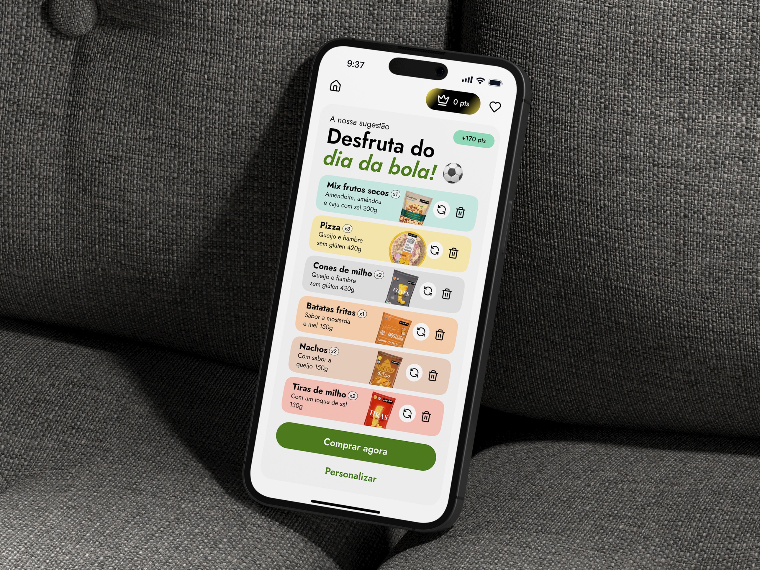
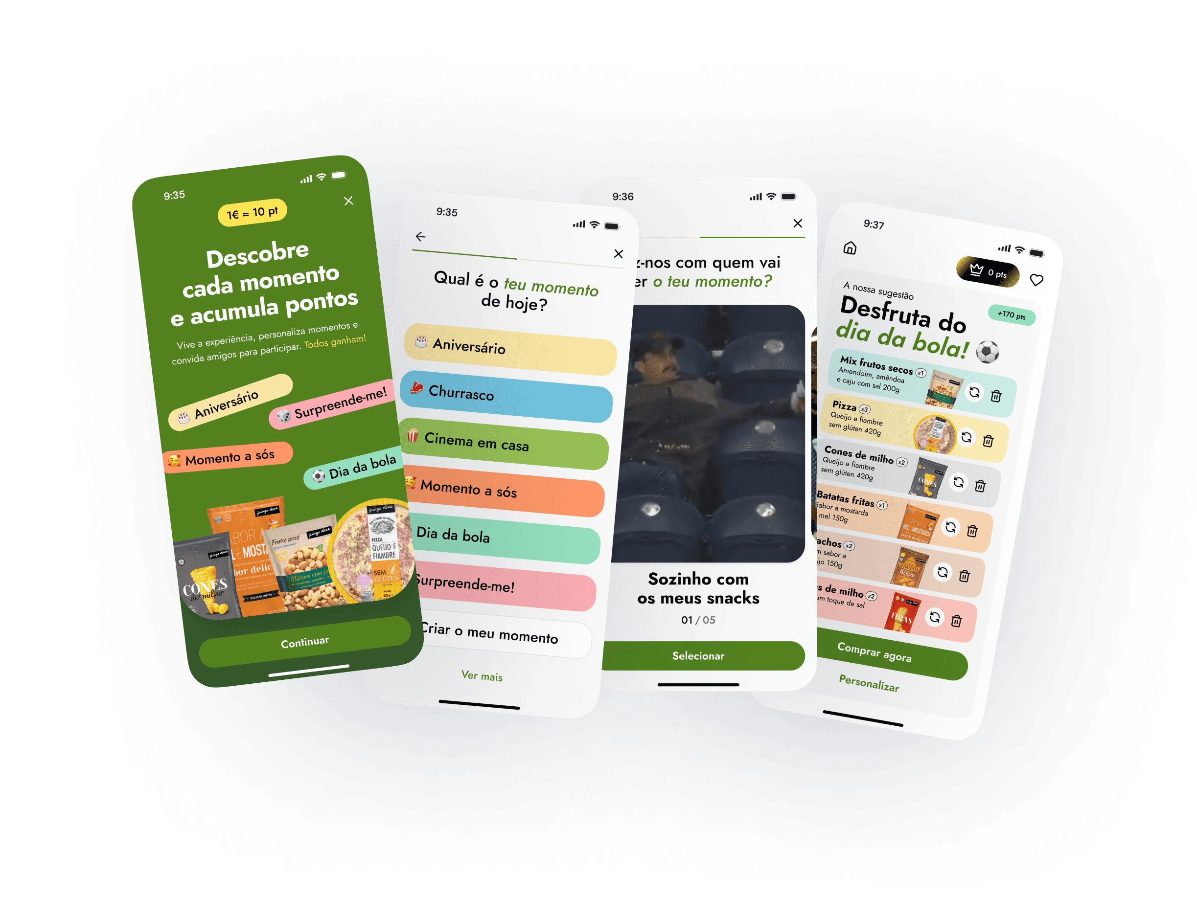
We worked on a new strategy for Pingo Doce’s indulgent product line, aiming to reshape how customers discover and buy items like ice cream, cookies, chocolates, and snacks. The approach focused on emotional and social relevance by introducing themed packs for specific moments and moods, such as “Movie Night,” “Game Day,” and “Chill at Home.” This helped reposition the category around shared experiences rather than isolated products.
See full case study
Role:
UX/UI Designer
Team:
1 Project Manager
4 Designers
4 Digital Marketeers